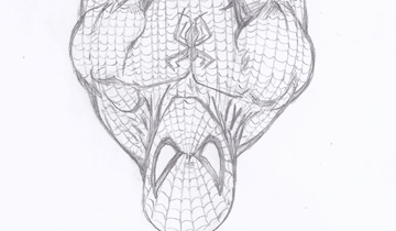
The following image is a drawing that I did of Spiderman a few days ago in the middle of the night! I was planning to use it for my webcomic versus comics‘ characters section. It is the perfect example of why you should always review an image before releasing it into the wild!
After drawing the image, I did not review it and simply scanned the image and published it online. In the middle of the night!! A few days after, my buddy Tarik and the guys let me know just how terrible the image was. Their complaints:
- Spiderman’s neck is just too big! and something just looks off with his neck
- Spiderman looks too built. His body looks more like Wolverine’s body than skinny Spiderman
- My buddy Rob told me that Spiderman’s legs are just too fat!
And after looking at the image, I agree with all of their criticism. I wanted to do a drawing of Spiderman hanging upside down. And even though I drew Spiderman right-side up, it still came out weird! I was originally using this image for the Spiderman character page of versus comics but after all the hate that this image got, I had to redraw Spiderman. Below is the new Spiderman image that I am using on the characters page of versus comics.


